
Libby App: Product Redesign
MOBILE PRODUCT STRATEGY & ACCESSIBILITY OPTIMIZATION
Libby is a market-leading digital library platform used by 90% of public libraries. While highly functional, my research identified significant friction points in how users manage complex digital collections. I led a comprehensive redesign focused on transforming the interface into a more intuitive, high-trust experience—prioritizing logical navigation and reducing the cognitive load for high-volume readers.
Role
- UI/UX Designer (End-to-End Case Study)
Focus
- User Research, Information Architecture, Accessibility, Interaction Design
The Challenge: Enhancing Control & Trust
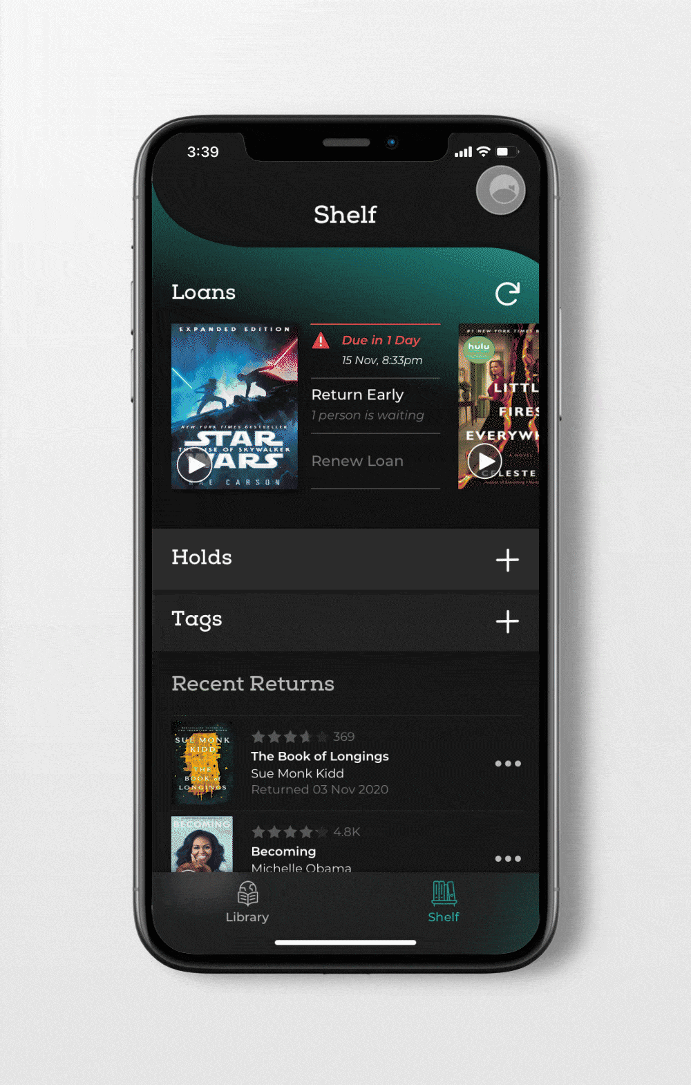
The primary challenge was solving “Information Overload.” Users frequently felt overwhelmed when managing multiple rentals and formats (e-books vs. audiobooks). My goal was to move away from a “one-size-fits-all” UI and create a frictionless, high-utility interface that gives users precise control over their digital shelf and app settings.
Discovery & Research Strategy
I grounded the redesign in the Jobs to be Done (JTBD) Framework to move beyond surface-level demographics and focus on actual user motivations.
- Job Stories: By analyzing hundreds of app store reviews, I mapped out specific “triggering events”—such as a user needing to quickly distinguish book formats during a morning commute.
- Affinity Mapping: I used affinity diagrams to categorize fragmented user feedback into four actionable pillars: Navigation, Format Distinction, Rental Management, and Settings Hierarchy.
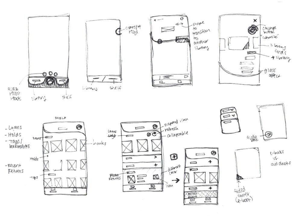
Design Challenges & Solutions
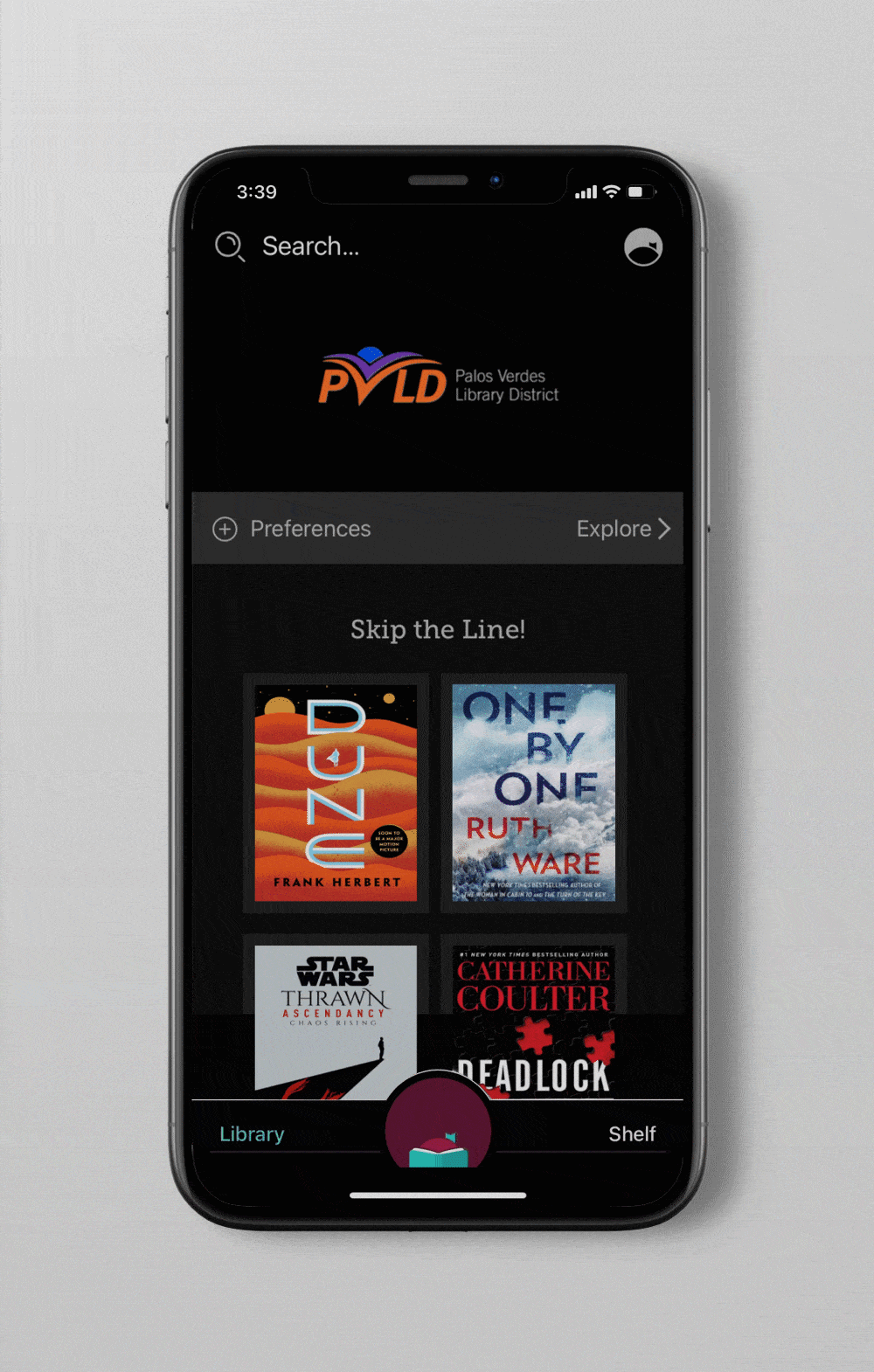
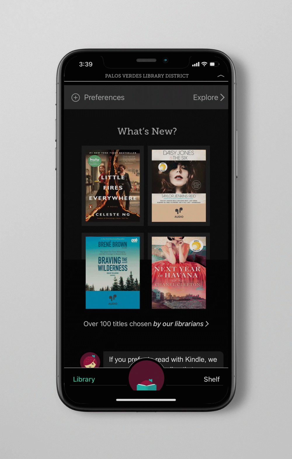
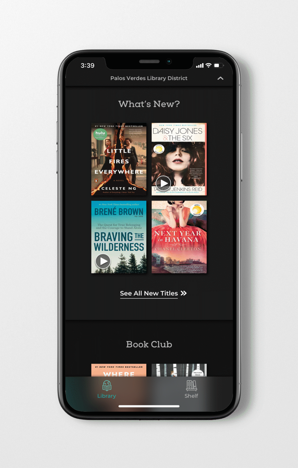
1. Purposeful Primary Navigation
Research showed that the existing navigation prioritized low-utility features (like changing the app icon’s skin tone) over pragmatic user needs.
- The Solution: I moved personalization settings into a dedicated panel and simplified the primary navigation to focus on Explore and Library.
- The Innovation: I introduced a “Current Read” persistent module that sits above the navigation, giving users one-tap access to their active book and real-time progress.
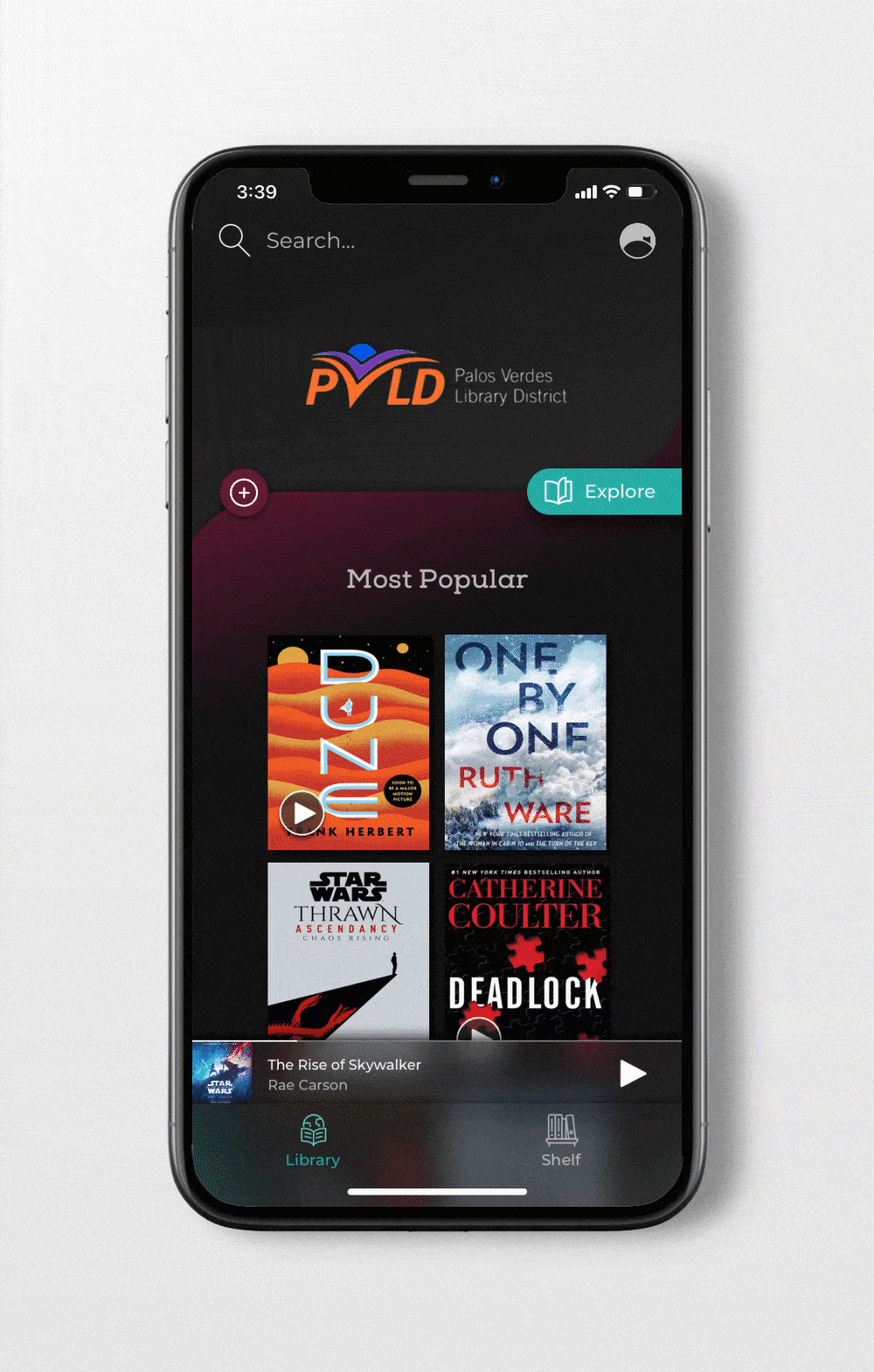
2. Solving the Format Friction (E-book vs. Audiobook)
A recurring pain point was the difficulty in distinguishing between digital formats, often leading to users borrowing the wrong version.
- The Solution: I replaced the small, low-contrast “AirPod” icon with a universal, high-contrast Play symbol for audiobooks. I also increased the type scale for format labels and ensured the UI maintained high accessibility standards, preventing icons from getting “lost” against varied book cover art.
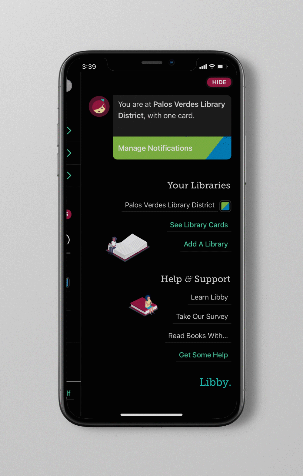
4. Establishing Settings Hierarchy
The original settings panel lacked a clear visual anchor, making simple notification updates feel confusing.
- The Solution: I restructured the panel using a Digital Library Card carousel for multiple library accounts and introduced a modular notification system. By using color-coded radio buttons and info-toggles, I reduced visual clutter while maintaining full transparency for the user.
Impact & Accessibility Takeaways
This redesign goes beyond aesthetics to address the long-term “reading health” of the user. A key focus was the Dark Mode optimization; instead of using stark 100% black, I implemented a 90% charcoal palette with subtle brand gradients. This reduces eye fatigue and improves legibility for night readers—a critical feature for a reading-centric product.
Note: This is a conceptual case study created for personal development. I am not affiliated with OverDrive or the Libby app. This project represents an independent exploration of user experience and interface improvements based on public user data.